A Burning Man-like festival held near Kulin, Western Australia, April 1 to 7. Fun was had.


A Burning Man-like festival held near Kulin, Western Australia, April 1 to 7. Fun was had.
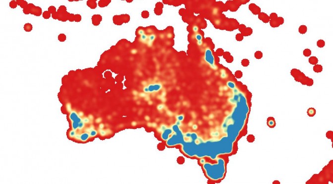
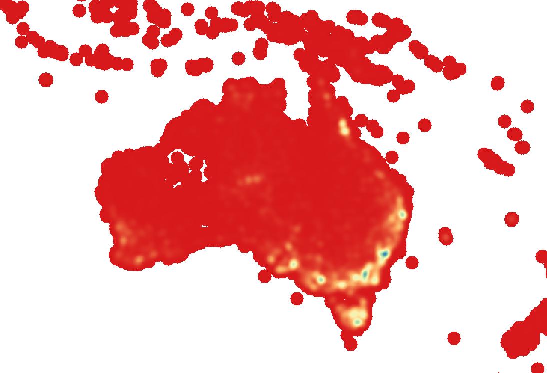
Using data from the Atlas of Living Australia and tools from Mapbox, I created a heatmap of observations of threatened plant species in Australia.
I accessed the ALA’s excellent web services API to get the data on threatened plant species observations. I wrote two python scripts to gather this data; the first got the GUIDs (a unique ID) of each plant species that had a Commonwealth conservation status of Rare, Vulnerable, Endangered, or Critically Endangered. Once I had all those GUIDs (around 4000 of them), I ran the second python script which queried the API for all observation records for each GUID (sorry for the server hit, ALA!). Once I had all those observations, I simply stripped the location coordinates out of them, as I didn’t need to know anything more about them for this project, and then wrote the coordinates to a csv file. The result was 11086 coordinates.
I loaded up QGIS and imported the csv of coordinates. Following these instructions, I built a heatmap from the coordinate points using a 100 km radius (meaning that the map shows numbers of other records within 100 km) and the Triweight kernel shape. I used a cell size of 0.1 map units (ie, degrees, since I was running this project in WGS84), which I figured would give good enough spatial resolution while keeping file size reasonable for upload. Many of the records I was working with were generalised to 0.1 degrees anyway, in order to protect the exact locations of the conservation-dependent plant species. In order to get the map onto the web, I used Mapbox’s TileMill software. I exported the heatmap from QGIS, reprojecting the image into Google Mercator projection (900913) to make it display properly in TileMill. From TileMill, I uploaded the map into my Mapbox account – and here it is.
The legend doesn’t show up in the embedded map, but you can see it in the full map. Here’s an explanation of what the colours actually mean. The numbers displayed in the legend are increments from 0 – 5.69 (roughly). The values refer to the number of records of threatened plant species observations within a 100 km radius of any spot. In the red sections, there were no other records within 100 km (ie there was only one record). In the blue sections, there were at least five other records within 100 km of the cell. The numbers were calculated based on the estimate cumulative cut of the full extent of the map (which may have been the wrong method to use – see below), using a cut value of 2 – 98%.
The pattern shown is that the known biodiversity hotspots tend to be blue coloured. This explains the blue in the south west corner, in the area between Melbourne and Adelaide, in Tasmania, and in central Queensland. That’s not a surprise. But this analysis was based on numbers of records, not necessarily numbers of species, and it was based on threatened species only, so there’s some other factors that affect the appearance of the map apart from biodiversity.
The first is survey effort. Areas closest to populated parts of the continent are, by default, likely to be more frequently visited by ecologists, recording observations of species. This explains the heavy blue colour up the east coast, where most of Australia’s population is concentrated. This factor may also explain the high values around Alice Springs in central Australia, Darwin, and Townsville in Queensland, which are not known as biodiversity hotspots, but where research institutions such as herbaria and universities are based, which allow increased recording of data. Survey effort (or lack thereof) may also explain the lack of many records in some areas that are known biodiversity hotspots – for instance, the Kimberley in WA, and to a lesser extent the Pilbara – which does have a faint orange/yellow colour, and which has been relatively highly surveyed due to environmental consultants carrying out environmental impact assessment surveys for the booming mining industry over the past ten years. For that reason, my expectation was that there would be more records in the Pilbara – but there are only a couple of Commonwealth-listed threatened species from the area, which probably explains it. High biodiversity doesn’t necessarily equate to large numbers of threatened species, either for entirely natural reasons, or because of delays in the reporting of data (which are quite likely to be a major contributing factor).
The final factor that may complicate things is that this study looked at threatened species. Therefore, it is likely that there will be more records in areas that have been highly disturbed, such as urban and agricultural areas, because due to Australia’s high rate of endemism, there are many species that only occur within small geographic areas, and when those areas have been heavily modified, it’s likely that those species will have become threatened. Again though, this theory fails to explain the lack of records in the Pilbara, an area that has been heavily disturbed by mining and grazing.
I wasn’t sure if the method I used to colour the raster image was the most appropriate. The main problem with this method is it fails to discriminate between pixels with higher values. The maximum value present in the raster was 81.977, which is considerably higher than five, which is the value at which the colours stop changing. This means that, although there are relatively few data points at these high levels (the mean value was 1.263, and standard deviation 4.763), the large range is all squished into that one colour. This could potentially hide areas of unusually high threatened species records.
In order to test this, I recoloured the map using the maximum and minimum values rather than the 2-98% cut, and using the actual, rather than estimated values, which takes a little longer (although the difference is negligible for this map), but results in the true (higher) value for the maximum. I also changed the colour increments from continuous (which defaulted to five colour classes) to incremental, and manually specified ten colour classes. The result looked like this:
As you can see, this is effective at highlighting the areas of really high observation numbers, however it too has a downside – the vast majority of pixels are now classified at the lowest levels, which means the main body of the variation in the map is invisible.
One solution to this problem is to manually modify the colour breakdown to produce the most visually clear and expressive map. I played around with this, and managed to develop a map which appeared to differentiate between the large number of pixels at the lower end of the spectrum, while allowing those few pixels at the very high end to stand out as highlights. The only downside to this is that it’s a very subjective process. I wanted the map coloration to have a clear mathematical relationship with the data, even if that meant losing a little bit of detail at the top end. For that reason, I stuck with the original method.
I don’t know. I think it must be a problem in the process of TileMill creating png map tiles out of the GeoTIFF raster. It’s not present in the raster in QGIS, and it’s not visible at all zoom scales in the TileMill map.
Definitely long overdue for an update. While I have a few things to catch up with from late last year, I’ve recently spent some time botanising in the Pilbara; near Newman and Port Hedland, and I’ll post about the Newman work now.
I spent a couple of weeks working near Newman, spread over two periods in November last year and March this year. Both jobs were flora surveys for mining proposals, and both jobs involved the use of a helicopter. I was quite excited about this at first, however the fun soon wore off. The helicopter was small, cramped, difficult to get in and out of, hot, noisy, and imparted a sense of hurry to the work which I didn’t enjoy, due to the fact that the pilot would often leave the engine and rotors running while waiting for me to finish off a site.

Another day begins
It was a great way to experience the landscape though, and to be able to see changes in vegetation types from above made the work easier. Every landscape has its optimal viewing distance for maximum visual beauty; and the stony hills of the Pilbara are best suited to being seen from about 100m up.

Stony hillsides with creeklines are common land forms in this part of the Pilbara
Being in the helicopter also enabled me to get an interesting (and sometimes slightly scary) angle on the weather. On most days our work was cut short by the development of thunderstorm cells, and several times we dodged around active thundersorms on our afternoon commute back to our camp.

Thunderstorms from the air
The weather was also interesting to photograph from the ground. This is the sky after a storm passed over us at Sylvania Station, where we camped:

While flying in the helicopter, it was interesting to note the number and extent of mining activities in this part of the country, which was mind boggling. Our daily commute took about an hour, and in this time we would pass over three active mines and several areas of development that appeared to be planned mines, as well as various camps and other infrastructure such as railways and roads. It seemed that there was some kind of construction project happening in every valley. If there was no major developments, then there would at least be drill pads on the ridges and sometimes the flats.

Mining landscape
The area north of Newman is known for its stony hills, gorges (exemplified by those at Karijini National Park), and open plains dissected by sandy creeks. The vegetation is ‘spinifex’ Triodia grasses with Acacia shrubs and/or sparse small Eucalyptus trees. Members of the Malvaceae (mallow) family are common shrubs; as are peas.
 Typical Pilbara landscape

View from above. Iron plant (Astrotricha hamptonii) in foreground.
 The pretty Cleome oxalidea occurred on clay flats in the area
I also encountered some mushrooms, both unusual for this area from my experience. An Amanita, found emerging from a rocky hillside, with an unusual double annulus:

And a Coprinus, or related genus, found in a dense creekline:

And a final landscape: